How to create a brand logo for your landing page and outreach efforts.
simplicity and clarity.
I created each of the above logos in 30 minutes using a very simple three-step process. I will explain the process below. But first...
Like a brand name, we don't need a logo to validate our idea, but it is nice to have a logo for the following reasons:
- It helps bring our idea to life and makes it feel more real to us and the people we talk to.
- It helps us feel more confident when we talk about our idea with potential customers.
- It makes our landing page look more professional and trustable, which in turn increases email signups.
- It's fun!
In short, there's something about having a semi-decent logo that brings a sense of legitimacy and confidence to our validation efforts.
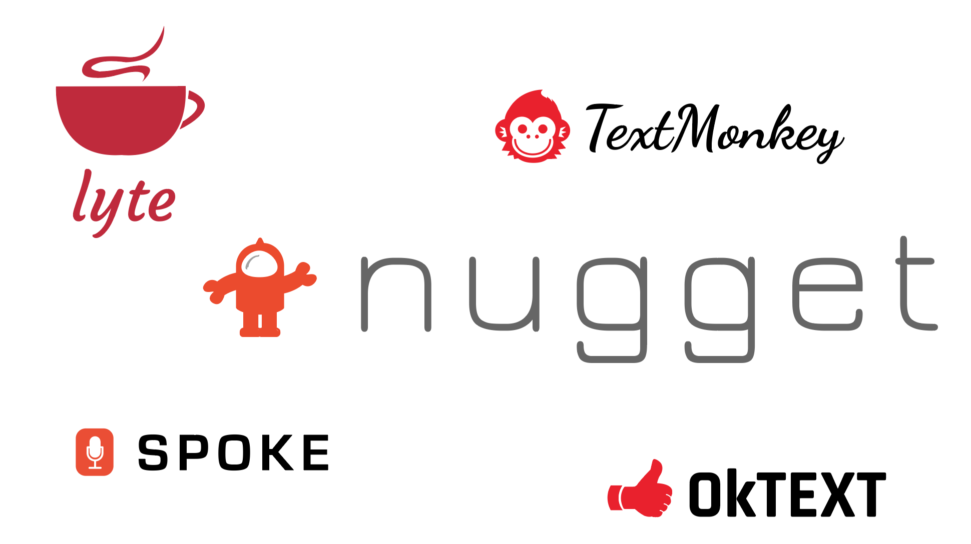
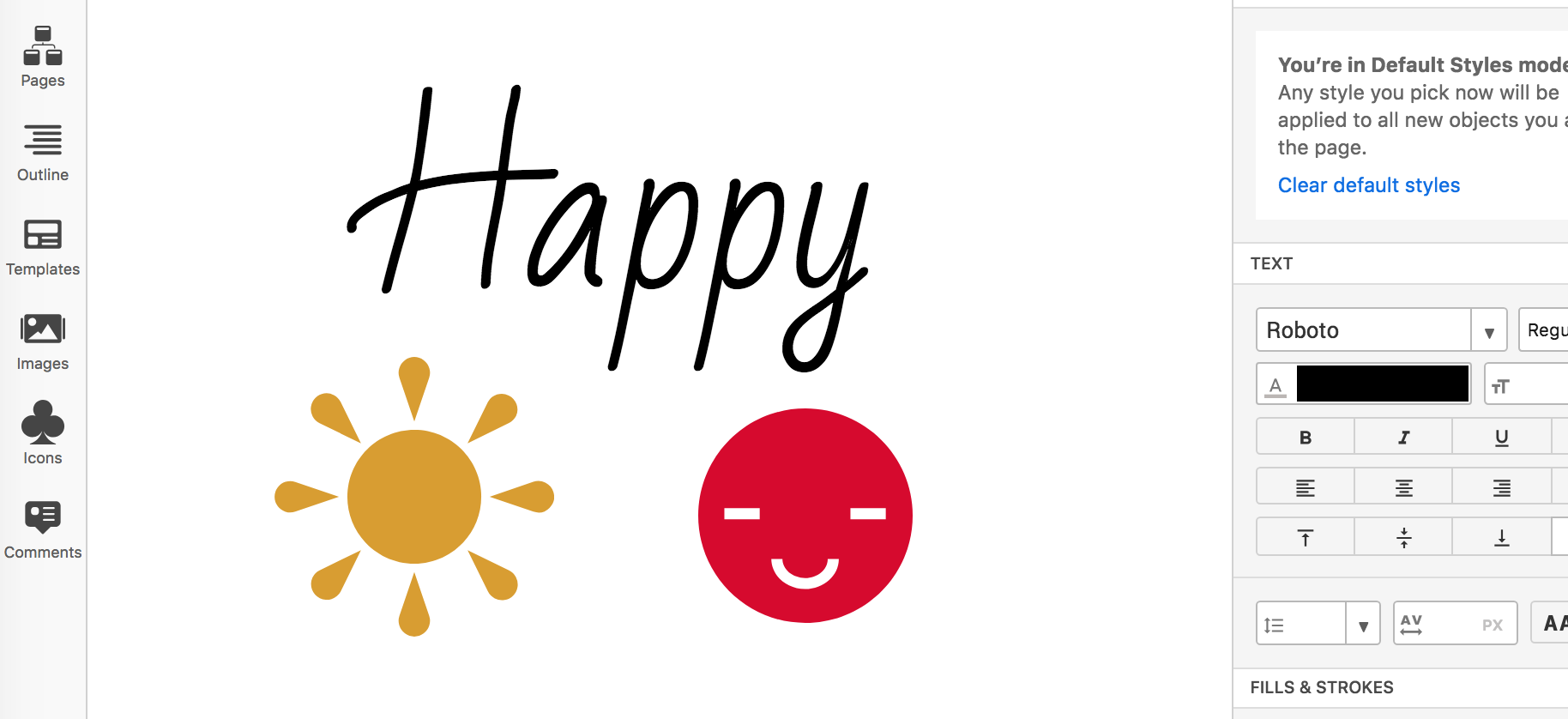
Firstly, a starter brand logo does not need to be good with a capital G. Here are a few world-class logos. We don't need to stress and try to make something this good:
The logos below are perfectly fine for a starter brand:
So, the cynical answer to "What makes a good starter brand logo?" is "anything." But a more considered answer is "A logo that supports our validation efforts."
Or, more specifically:
- It's not embarrassing!
- It doesn't suck!
- It looks like it could be a "real" thing!
The quickest, easiest, and cheapest way I've found to do all of that is to use the three-step process detailed in the rest of this lesson.
- What makes a good logo? - Jacob Cass [5 mins]
The method I use consists of these three steps:
- Step #1: Pick a font that suits your brand idea using Google Fonts.
- Step #2: Pick some flat icons that suit your brand idea using Flaticon.
- Step #3: Combine them in Moqups and try out different colors and letter spacing until you find something you like.
That's it.
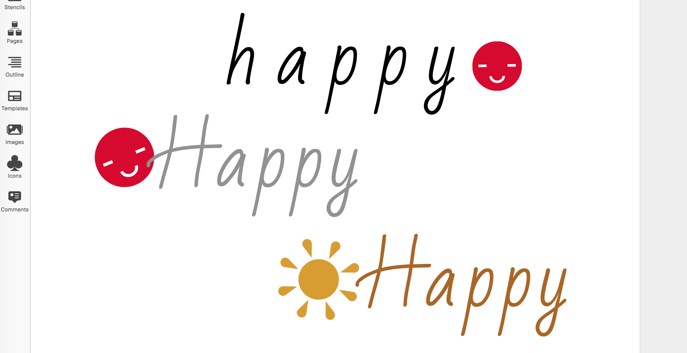
1) Head on over to Google Fonts and type your brand idea on top of the sample font text.
Here is an example with the brand idea "happy":

2) Make the text bigger by dragging the font sizer (up to 70px-90px)
3) Click "APPLY TO ALL FONTS"
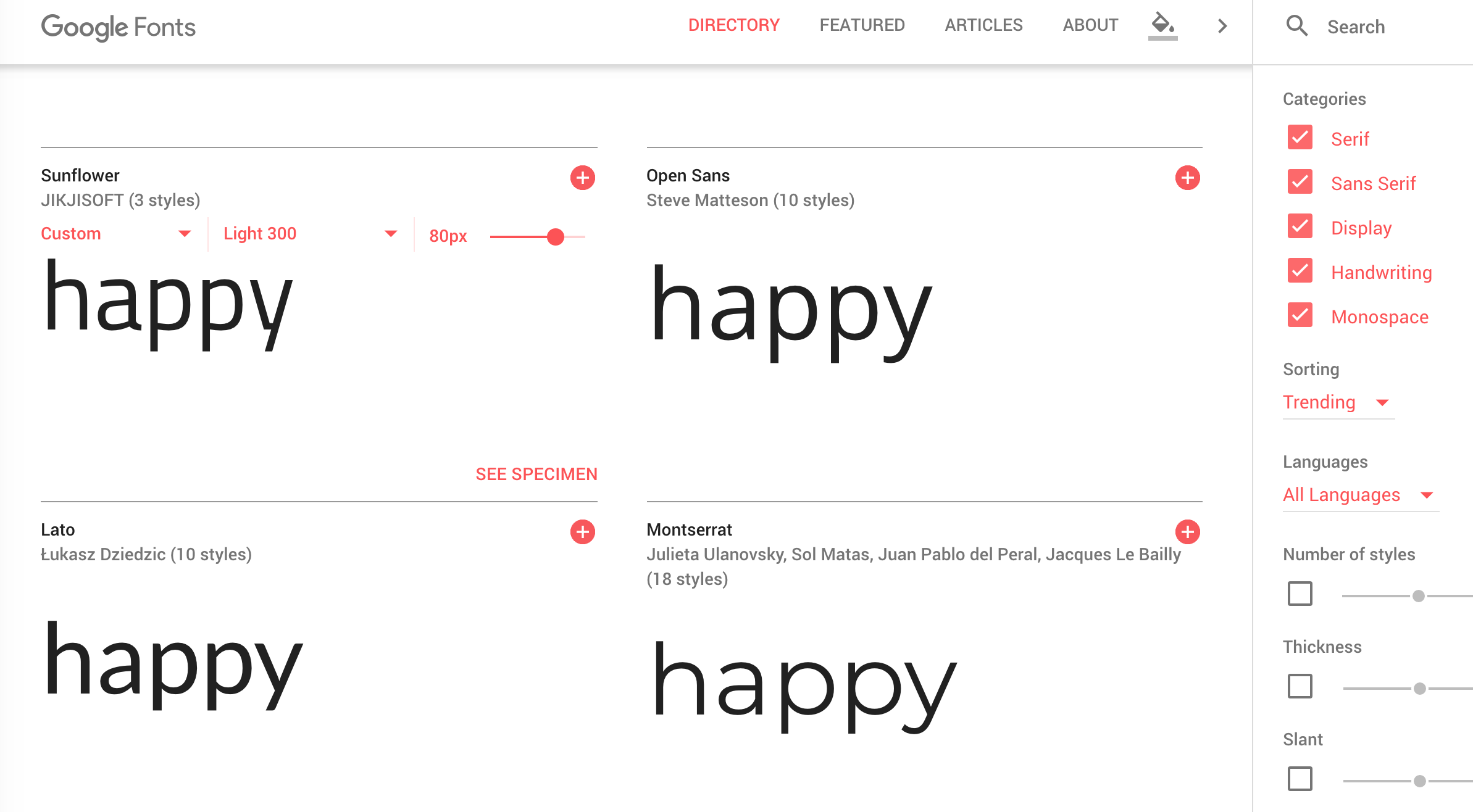
4) Scroll through until you find a font that just looks right - something that already looks "like a logo" right there on the page.
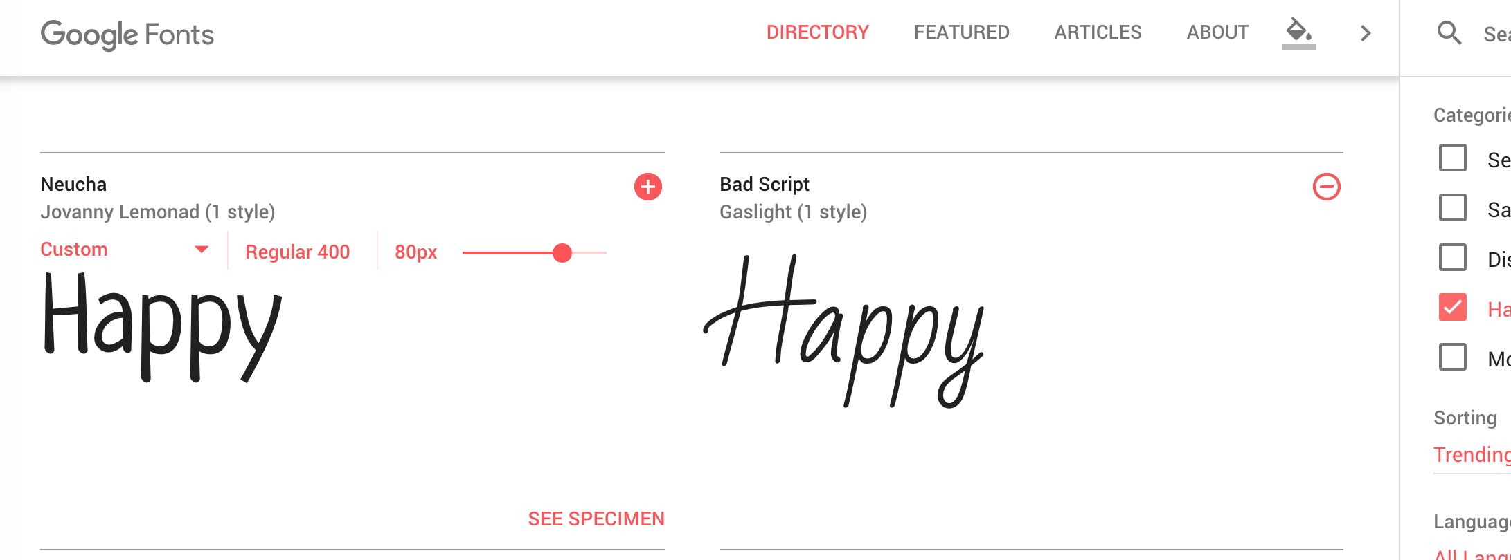
- Try turning off all font types apart from "Display" and "Handwriting" to only show fonts with lots of character.
- Try different capitalization variants such as "Happy" or "HAPPY." Remember to use the "apply to all fonts" option.
5) When you find something you like, take note of the font name. We will use it in Step 3.
In this case, I liked the font "Bad Script" with a capital H variant of Happy.
1) Head on over to Flaticon.
2) Set the search options to "Monocolor" and "Filled"
It's hard to go wrong if the icon is filled and only one color. All icons like that are very simple by default.
3) Search with keywords related to your brand idea.
4) When you see a few you icons you like, download them as .svg's (we'll use SVG because it never pixelates).
When you download a mono-color icon, you can choose the color to download it as. Set it to something you like!
If you don't have a paid Flaticon account, you shoud give credit for the logo use. Consider adding credit in the footer of your website.
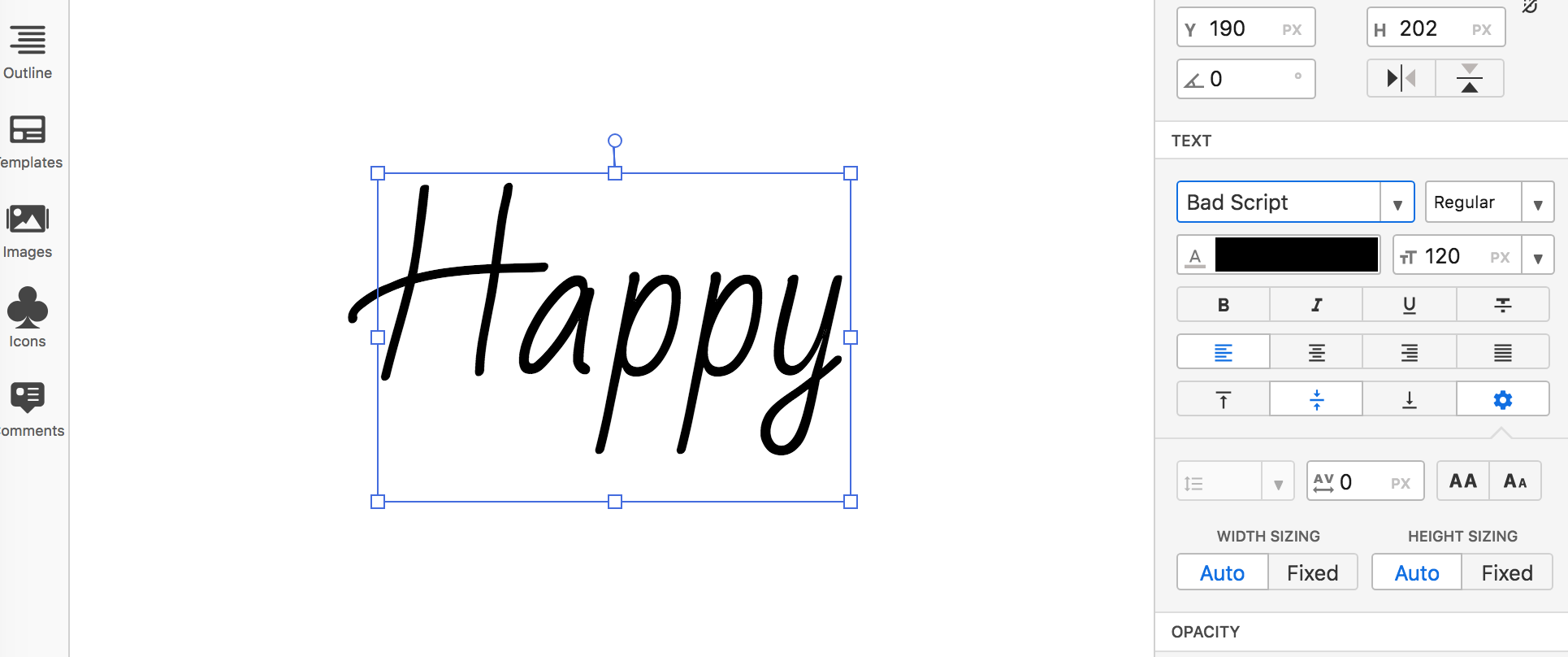
1) Head on over to Moqups and create a free account or use the "Try it now for free" option to open a blank page.
You will need a $13/month subscription to export from Moqups. If you have another art program that you regularly use, follow along in that program.
2) Click "Stencils" icon (on the left) and drag a "Heading" item onto the page.
3) Double-click the heading and change it to the name of your brand idea.
4) Make sure the heading is selected, and click the format icon (top right). Change the font to the one you liked. Do that by typing in the font name in the text style box. Also set the font size to something big like 120.
5) Click the "images" icon on the left, upload your SVG files, and drag them on to the page.
Note: I set the color of the SVG's when I downloaded them from Flaticon.
6) Play with the positioning and letter spacing. For each new variant, copy/paste and try something different.
7) Copy/paste the one you like on to a new blank page and export it as a .png with "selected page," "trim contents to bounds," and "transparent background" checked.
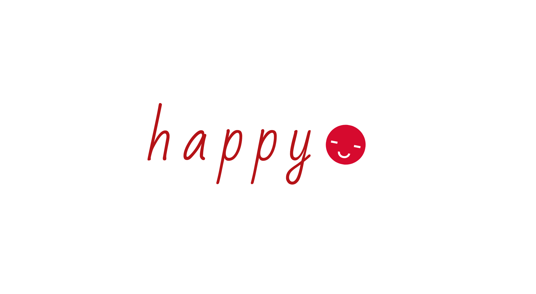
I started off liking the capital H variant, but when I played with it in Moqups and applied letter spacing, the lower case variant seemed to work much better.
- If you need help coming up with a good color combination I recommend the tool Paletton.
- You don't need to use Moqups for this process. You can use your favorite art editor if you already have one you prefer.
- There are services that enable you to make logos with a drag-drop interface such as Logojoy. Personally, I don't find them to be as flexible as the above method, but they still work well.
- Again, there's nothing wrong with creating a logo as you start to explore a market instead of a speficic idea. It can help you establish your identity and presence in the market, and evolve over time.